


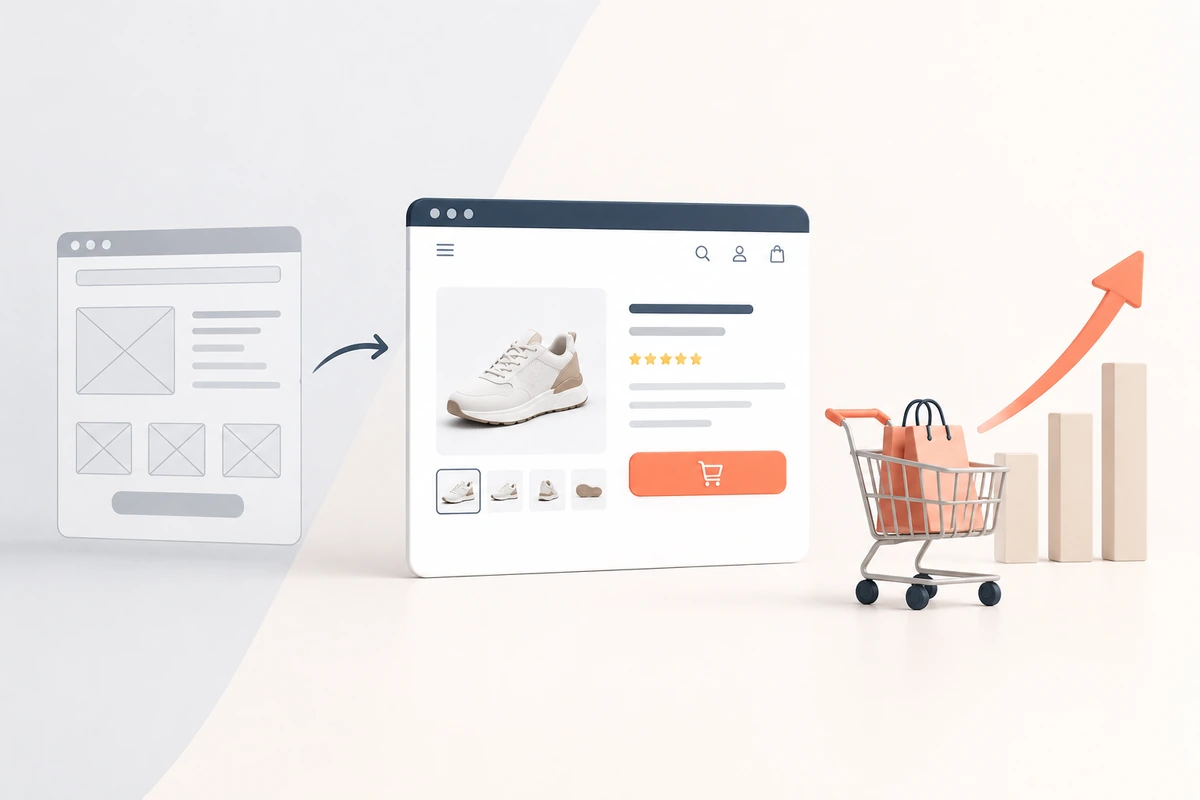
UX/UI design impacts conversion rates on ecommerce websites more directly than almost any other factor a brand controls, because a confusing or slow experience loses the sale before the product itself ever gets a fair chance. The average online shopping cart abandonment rate sits at around 70 percent, according to the Baymard Institute’s meta-analysis of ecommerce usability research, and a large share of that is driven by fixable design and usability problems, not by people simply changing their minds. Good UX/UI doesn’t just make a site look better, it removes the friction that stops a shopper from finishing a purchase they already intended to make.
Key takeaways (The TL;DR)
- Around 70 percent of ecommerce carts are abandoned before checkout, and Baymard Institute research suggests fixing checkout usability issues alone can lift conversion by up to 35 percent.
- Unexpected costs at checkout, shipping fees and taxes revealed too late, are the single biggest driver of cart abandonment, ahead of complicated forms or forced account creation.
- Mobile shoppers abandon carts at a noticeably higher rate than desktop shoppers, making mobile-first checkout design a priority rather than an afterthought.
- UI elements like clear pricing, visible trust signals, and simple navigation work alongside UX flow to reduce hesitation at exactly the moments a shopper is deciding whether to buy.
UX (user experience) and UI (user interface) get used almost interchangeably, but they solve different problems. UX is about the path a shopper takes, how easy it is to find a product, understand pricing, and complete checkout. UI is what that path actually looks like: the buttons, layout, typography, and visual hierarchy that make the experience feel trustworthy or make it feel confusing. A conversion-focused ecommerce site needs both working together, since a beautifully designed page with a confusing checkout flow converts about as poorly as an intuitive flow that looks unfinished and unreliable.
The Checkout Is Where Most Conversion Rate Is Won or Lost
Checkout usability issues are responsible for a disproportionate share of lost ecommerce sales. Baymard’s research points to unexpected extra costs, shipping fees or taxes that only appear at the final step, as the leading cause of abandonment, followed closely by checkouts that force account creation or ask for more form fields than necessary. Every additional field, every unclear cost, and every extra step between “add to cart” and “order confirmed” is a point where a shopper can second-guess the purchase and leave. Reducing the number of form fields, showing total cost upfront, and offering a guest checkout option are some of the highest-impact, lowest-effort fixes available to most ecommerce sites.
Page Speed and the Mobile Experience
Mobile traffic makes up the majority of ecommerce visits today, but mobile checkouts consistently show higher abandonment rates than desktop. Smaller screens make form fields more tedious to fill, slower mobile connections amplify the cost of a sluggish page, and a layout that works fine on a laptop can be genuinely difficult to use on a phone. A mobile-first approach to checkout design, larger tap targets, auto-filled fields where possible, and native payment options like Apple Pay or Google Pay, closes a meaningful part of that gap.
Trust Signals and Visual Design
The UI side of conversion is less about flow and more about whether a shopper trusts the site enough to enter payment details at all. Clear product photography, visible return policies, security badges near the payment field, and a design that doesn’t look dated or broken all reduce hesitation at the exact moment it matters most. None of these are complicated to implement, but they’re frequently the first things cut when a site is built quickly or updated in a rush.
Common UX Mistakes Costing Ecommerce Brands Sales
The recurring issues Baymard’s large-scale testing keeps finding, even on major retail sites, are surprisingly consistent: burying the total cost until the final checkout step, requiring account creation before allowing a purchase, unclear or hidden return policies, and navigation that makes it hard to get from a product page back to browsing without losing progress. None of these require a full redesign to fix, but they do require someone to actually test the checkout flow the way a real, slightly impatient shopper would.
How AKOI Approaches This
AKOI’s UX/UI design team audits an ecommerce site’s actual checkout flow and navigation before recommending any visual redesign, since a site can look polished and still lose sales to a slow, confusing path to purchase. Design decisions are made around where shoppers are actually dropping off, not just around how a page looks in isolation.
Conclusion
UX/UI design is one of the few levers an ecommerce brand controls that can move conversion rate without spending a rupee more on ad traffic. The Baymard Institute’s cart abandonment research makes the scale of the opportunity clear: a large share of lost sales come from fixable usability problems, not from people who were never going to buy. Fixing the checkout flow, showing costs upfront, and designing for mobile first are usually the fastest wins available before touching anything else on the site.
Frequently Asked Questions
What is the average ecommerce cart abandonment rate?
Around 70 percent, based on the Baymard Institute’s meta-analysis of dozens of ecommerce usability studies. Roughly seven out of ten shoppers who add a product to their cart leave without completing the purchase.
What’s the biggest cause of cart abandonment?
Unexpected extra costs at checkout, usually shipping fees or taxes that only appear at the final step, are consistently the top reported reason shoppers abandon their cart.
What’s the difference between UX and UI design?
UX covers the path a shopper takes through a site, how easy it is to find products and complete checkout, while UI covers the visual layer: buttons, layout, and typography that shape how trustworthy and easy to use that path actually feels.
Does mobile checkout design really matter that much?
Yes. Mobile traffic makes up most ecommerce visits, but mobile checkouts consistently show higher abandonment rates than desktop, largely due to smaller screens, slower connections, and forms that aren’t optimized for touch input.
Can improving checkout UX really increase conversion rate?
Baymard Institute’s research suggests fixing common checkout usability issues can increase conversion rate significantly on large ecommerce sites, since many of the causes of abandonment are fixable design problems rather than genuine loss of purchase intent.
Should ecommerce sites require account creation to check out?
Generally no. Forced account creation is one of the most commonly cited reasons shoppers abandon a cart, and offering a guest checkout option tends to reduce that friction significantly.